Use of Statistics in Consumable manufacture and control – Part two – Is it in control?
I hope I have not lost everybody since my first article!
In my first article, (Use of Statistics in Consumable manufacture and control – Part one – Am I testing this right?) I outlined how to assess your test method using the GR&R method to assess if the measurement technique can assess the changes within a shell during testing. In the following article, I decided to review ways in which these test results can be used to assess if a process or material is in control. This is vital for keeping your process in control and stable over time. As a supplier, we ensure we are keeping raw materials and finished goods in spec also.
Below we will review Statistical Process Control (SPC) charts to assess if a process is in control. We will review how to interpret special causes, process shifts and trends. As a qualified 6 Sigma Green Belt Engineer, I have seen the benefits of using trending to make sense of the wealth of information coming from a foundry at time and reduce noise, control specifications and improve yield.
So let’s begin!
IMR Charts
First, we will review an IMR chart which is one of the most common tools used for trending and control. A typical IMR chart can be found in figure 1.
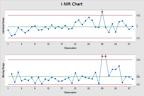
Figure 1 – Typical IMR chart
An IMR chart is a combination of two graphs, an individual chart and a moving range. An individual chart is quite simple to understand. This is simply the results you are plotting trended over time.
NOTE: It is essential for IMR charts that these are time ordered. It is key it is given some order within the dataset to ensure trends can be plotted. Within the foundry process, it can be interesting to assess if there are trends based on when they went through the shell room/autoclave processes to assess if this shows trends of issues within your process.
Within the Individual chart, there are three lines. These are explained below:
- X Bar – This is the average of all the individual values
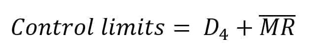
- LCL/UCL – This is the lower and upper control limit of the dataset. IT is not three times the standard deviation within IMR charts and can be calculated by:
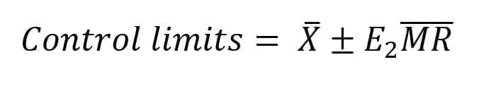
In this equation, E2 is a constant based of the data set and MR-Bar is the average moving range.
Second graph within an IMR is the moving range (MR). The moving range is a measure of the difference of the data point from the previous data point. It will have one less data point than the individual graph.
- MR Bar – This is the average of all the individual values
- LCL/UCL – This is the lower and upper control limit of the dataset. Witihin MR charts, the LCL is zero. The UCL can be calculated by:
Where , D4 is a constant based of the data set and MR-Bar is the average moving range.
The moving range should first be analysed when reviewing a dataset. The “shape” and trends within the MR can tell more than the information within the individual graph. There are two distinct features which can be seen within the MR chart:
Shift – A shift is signified by a single point outside of the control limits of the MR chart. A shift can show you a shift in your data from one area to another area. This can be seen below.
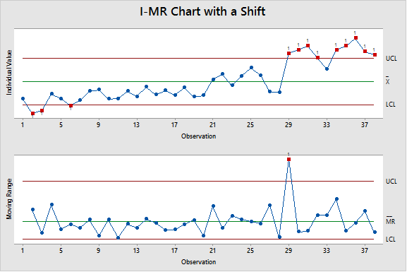
Figure 2 – Typical IMR chart with a shift
Special cause – A special cause is signified by two points outside the Control limits of the MR.
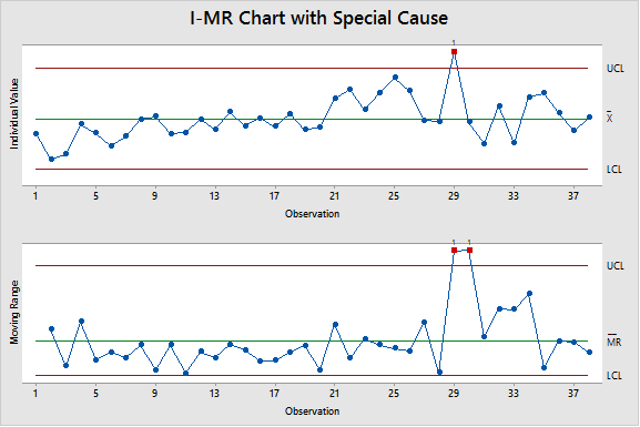
Figure 3a – Typical IMR chart with a special cause
One last trend can only be seen in the individuals trend, this is the slowly drift of the date over time. As it is not a sudden change, the MR does not pick up on this subtle change over time.
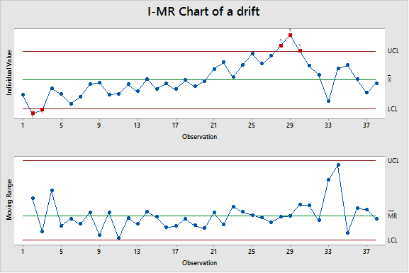
Figure 3b – Typical IMR chart with a drift
Other features can also be added into the graph to increase understanding. Known changes in the process (for example a new batch of material), can be added as stages within the IMR chart to assess if a change to the process occurred as a result. This can be seen below.
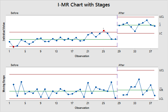
Figure 4 – Typical IMR chart with stages
This is perhaps the easiest chart to understand when looking at control within your process. As outlined in my recent presentation at the EICF Workshop in Brno [1], it is essential to ensure the trends and process control is present in consumables supplied to the PIC industry to ensure the output casting is properly controlled.
Conclusion
An IMR chart is a great tool to ensure your process is within control and trending according to historical values. It is worth noting that this method will ensure your process is within control of historical values, it will not suggest where the specification limits or where if you are controlling to the right controls within your process.
References
[1] G Dooley, Risk Reduction through inspection and control of consumable materials within the Precision Investment Casting Process. INSPECTION CAPABILITIES FOR TOMORROW’S FOUNDRY – A BEST PRACTICE WORKSHOP FOR FOUNDRY PRACTITIONERS, EICF Workshop, Brno, CZ
Disclaimer
Contact your nearest REMET Sales Office regarding product specifications.
Contact your REMET Territory Manager and visit www.remet.com if you have any questions or require additional information.
Information and/or recommendations based on research and technical data believed to be reliable. Offered free of charge for use by persons with technical skills, at their own discretion and risk, without guarantee of accuracy REMET makes no warranties, express or implied, and assumes no liability as to the use of its products or of any information pertaining thereto. Nothing herein is intended as a recommendation to infringe any patent.